The owner of RJ’s Spirit Shop approached me about a rebrand for his store. He already had the name picked out, “The Wine House,” but he needed a new visual identity to represent the upscale, modern feel of his new name.
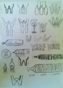
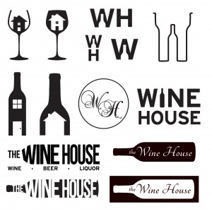
I started off, as always, putting pencil to paper. I sketched out some ideas that communicated different aspects of the name that the owner wanted to highlight, to see what worked best together.
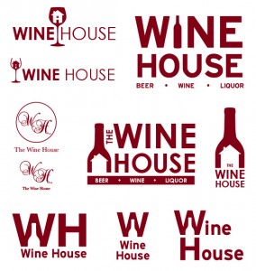
Then I digitized the sketches, refining, cleaning up, and eliminating the ideas I felt weren’t as effective. I explored the idea of a wine bottle or a house image revealing itself in the negative space, and some varying levels of formality.
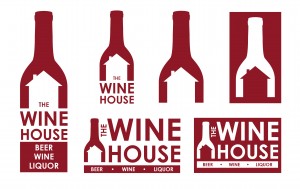
I continued to refine, finding the concepts that were most interesting and effective. I showed these to the client, and we had a few rounds of minor revisions.
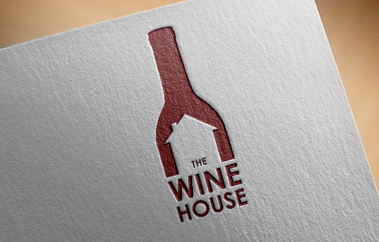
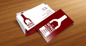
After going through the concepts, the client chose this idea, which I then expanded into different orientations and lockups for various uses.

